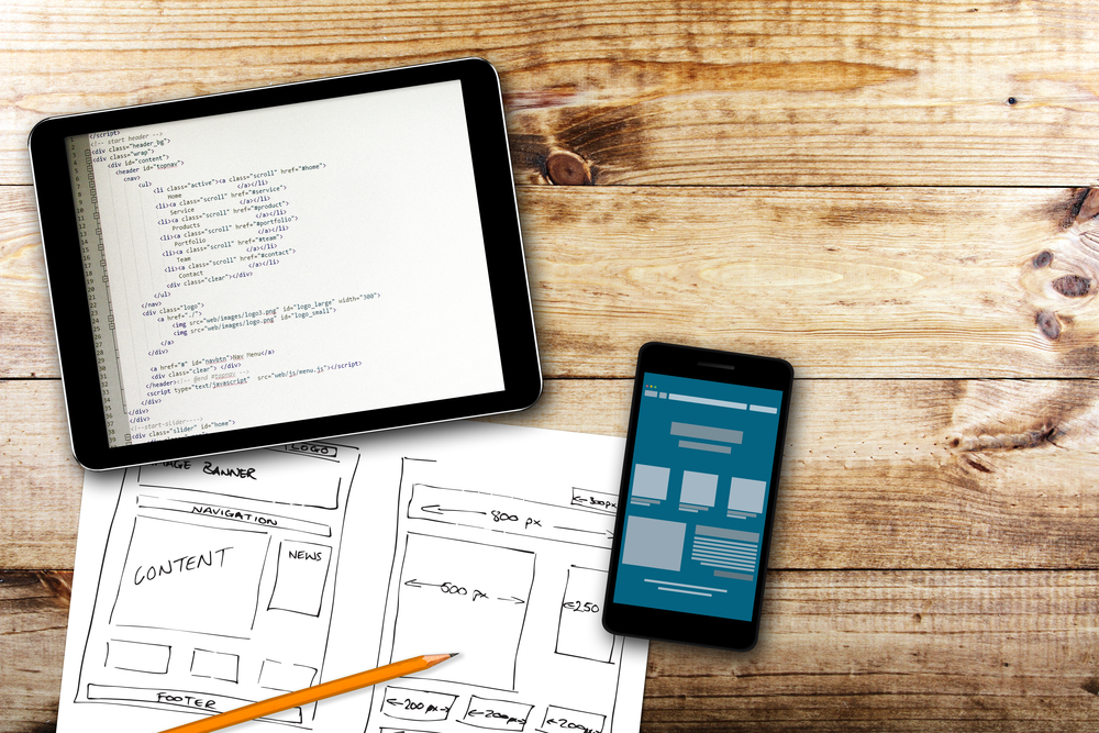
Responsive Web Design: Tips on Maximizing Your Online Presence From a Leading Web Design Firm
In today’s digital age, having a strong online presence is crucial for businesses of all sizes. At our web design firm, we specialize in creating innovative websites for just $200 per month, focusing on responsive web design (RWD) to ensure your site looks and performs great on any device. Here are our top tips on making the most out of responsive web design to enhance your online visibility and user engagement.
Start With a Mobile-First Approach
In an era where mobile usage surpasses desktop, starting your design process with a mobile-first approach is essential. This means designing for the smallest screen first and scaling up. It ensures that your website’s most important elements are optimized for mobile users, offering a seamless experience regardless of device.
- Emphasize simplicity: Focus on essential features and content for mobile users.
- Optimize navigation: Ensure easy navigation with thumb-friendly design elements.
- Test on real devices: Validate your design on actual mobile devices for accuracy.
Flexible Grids Are Key
The foundation of any responsive website is a flexible grid system. This technique allows your site’s layout to adapt to the viewing environment by using relative units like percentages instead of absolute units like pixels. Flexible grids ensure that all elements resize in relation to one another, providing consistency across devices.
- Use fluid layouts: Design with fluid grid systems that use percentages for widths.
- Implement CSS Flexbox or Grid Layout: Modern CSS technologies for better layout flexibility.
- Maintain consistent spacing and alignment: Keep a harmonious look and feel across devices.
Optimize Images
High-resolution images can significantly slow down your website on mobile devices. Optimizing images for responsive design means ensuring they are not larger than necessary and are saved in a web-friendly format. Additionally, using adaptive images that change in size based on the user’s screen can further enhance your site’s performance and speed.
- Compress images: Reduce file size without losing quality.
- Use responsive image solutions: Implement srcset and sizes attributes for adaptive images.
- Consider art direction: Crop or change images for different screen sizes to improve visual impact.
Implement Media Queries
Media queries are a cornerstone of responsive design, allowing you to create a dynamic presentation of your website based on the user’s screen size, resolution, and orientation. By incorporating media queries, you can apply specific CSS styles to different breakpoints (e.g., smartphones, tablets, desktops), ensuring a customized and user-friendly experience.
- Define breakpoints wisely: Set media query breakpoints at common device sizes.
- Keep content legible: Adjust font sizes, line heights, and button sizes for readability.
- Conditional loading: Load resources only when necessary based on the viewport.

Prioritize Content Hierarchy
With varying screen sizes, prioritizing content hierarchy becomes more important than ever. Users should be able to access the most crucial information effortlessly. Structuring your site’s content to highlight key messages and calls to action, especially on smaller screens, will improve navigation and user engagement.
- Streamline content: Eliminate non-essential elements on smaller screens.
- Enhance visibility of key elements: Make important information and CTAs stand out.
- Adapt content layout: Change layouts to ensure a smooth flow of information on different devices.
Test, Test, and Test Again
One of the most critical steps in responsive web design is thorough testing across various devices and browsers. This process helps identify and fix any issues that could disrupt the user experience. Regular testing ensures your website remains accessible and enjoyable for all users, regardless of how they access it.
- Use device emulators: Simulate various devices for initial testing.
- Conduct user testing: Gather feedback from real users on different devices.
- Utilize browser testing tools: Check compatibility and performance across browsers.
Leverage Responsive Design Tools and Frameworks
Numerous tools and frameworks can simplify the responsive design process. Popular options like Bootstrap or Foundation provide a set of pre-designed components that are already optimized for responsiveness, speeding up development time and ensuring consistency across different projects.
- Explore CSS frameworks: Bootstrap, Foundation, or Tailwind for rapid development.
- Use responsive design testing tools: Tools like BrowserStack or Responsinator for testing.
- Incorporate design aids: Utilize Sketch or Adobe XD for designing with responsive grids.
Conclusion
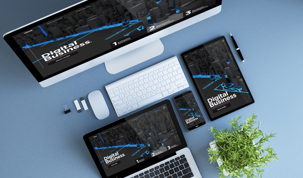
Responsive web design is not just a trend but a fundamental approach to web development that addresses the diverse range of devices used to access the internet today. By following these tips, businesses can ensure their website not only reaches a wider audience but also provides a positive and engaging user experience.
At our web design firm, we’re committed to delivering high-quality, responsive websites at an affordable monthly rate of $200. We understand the importance of your online presence and are dedicated to helping you achieve your digital goals with cutting-edge design and technology.